
Wednesday, 23 December 2009
Wednesday, 16 December 2009


final front cover
 This is my final front cover, i will make adjustments to this front cover when i get feedback from my classmates and my teachers to make it look better.
Monday, 14 December 2009
double page spread mock up 1
 This is a mock up for my double page spread, this is just to see what looks good and not. I haven't used the proper text or the image that i will be using for my final product as i am going to my own pictures a better font and it will have more effects on to make it stand out a lot more.
Friday, 11 December 2009
Double page spread layout 4
 I like this double page spread because it is very effective and i think even though the image is on the left hand side there is a image also on the right to balance it out. the thing i don't like about this double page spread is that there is a quote on the image when the reader wouldn't of read the interview yet. I think that this would be good if i made some slight changes t0 make it look better and more pleasing to the eye.
Double page spread layout 3

This is my third double page spread layout and i think that this one is good but not as good as my other two because i think that the picture should be on the right hand side not the left because it looks better.I also don't like how there is a quote on the picture and masthead because it is before the interview.
Double page spread layout 2

This is my second double page spread layout, i like this because there isn't that much text and this would mean that the customer wont get bored of reading the article. I think that this is a good layout because there is a big picture which will draw the customers eye to this picture and also make the reader want to read the article.
Double page spread layout
 This is my first layout of my double page spread. I like this layout because none of the text or the picture is going to be broken because of the middle cut. I also like this layout because i have little quotes in the middle of the text to break up the text altogether. This means that the reader wont get bored by the amount of text there is.
Tuesday, 8 December 2009


contents layout mock up five
 This is nearly the same as my fourth mock up but i have changed a few things around. I like this one more than my fourth mock up because of the masthead, it looks better and it is easier for the customer to see.
contents layout mock up four
 This is my fourth contents mock up and i think this is plain and simple and would attract the customers eye. This is because they haven't got much to look at and their eye would be drawn to the big picture and then they would look at the contents.
Contents layout mock up three
 This is my third mock up of my contents page. I think this is nice because the pictures split up the text which makes it easier for the customers to read. the black on my background is what colour my background would be for my real music magazine.
contents layout mock up two
 This is my second contents layout mock up. I like this one because it is a little bit different and it has room for both pictures and the captions for the pictures, but also room for the contents its self.
contents layout mock up one
 This is my first contents layout so far i will be doing 4 or 5 and then seeing which one i like the best. I like this one because i have 3 pictures and text so there wont be too much text on one page, this means that the customer won't be put off by how much text is on the screen.
Front cover Layout
 This is my final layout for my front cover that i will be using for my music magazine.
Media Studies Stages
Check out this SlideShare Presentation:
Media Studies Stages
View more presentations from beckymahan2003.
Monday, 30 November 2009
Planning My Music Front Cover
Check out this SlideShare Presentation:
Planning My Music Front Cover
View more presentations from beckymahan2003.
Friday, 27 November 2009
Feedback on my front cover mock up!
Chris Percival
Looks good, I like the colour of the background compared to the colour of the masthead, (makes the masthead stand out, so the viewer immediatly knows what magazine it is). I would maybe fade the caption over Oasis to make them stand out more, and maybe make the image a bit bigger. I would make the price a little bit smaller as well and maybe the same colour as the masthead to show consistency.
Ben Murphy
The thing that I like the most about this music magazine cover is the layout. I think that you have set things like your masthead and main picture in a very normal way; hence that the audience will automatically recognise that it is a music magazine and therefore making it look far more professional. However, I am not sure about your use of black which is placed at the top and bottom of your cover. With extra time this black could be made to blend into your picture and this would make the cover look even more professional. I also think that the chosen colours for your fonts could be altered slightly, this would make your fonts go with the picture and your use of black a lot more.
Jamie Vout
The main heading is very effective as the font a colour stand out, comparing to the back ground and the main picture. The picture that size works very well as it is easy to see who the audience is for. However i would have a lighter back ground and some layering with the picture would be more effcitve than just title picture writing. Also i would write more about what is in the magazine to draw more people into wanting to buy the magazine.
Emily Shufflebottom
The first thing I noticed was the headline which was I thought was very unique because it is not something you would usely see on a music magazine front cover. I also think that the images are very effective because they both match the colour scheme of black and white. I like how the text is all one colour and how it is layered over the images and how the headline really catches the attention of the reader. Finally, I like how the price is at the top of the page and it matches the colours of the text. This makes it very effective for the audience to buy the magazine.
Mr Taylor
Good colour scheme, effective photo and authentic layout. I'd advise you to consider using an image that covers the whole page, rather than just the middle block. I also think the fonts could be better tweaked to fit your target auidence.

Different style of fonts
 These are some fonts that i have found that i liked. I changed the colours and added some effects to see which one would look better on my front cover.
what i have been doing this week!
I have been constructing the layout for my front page. I will be posting them very soon so you can see what layouts i have come up with.
Thursday, 19 November 2009
Mock up one
 This is a simple mock up just to see if the layout of my front cover would work. I really like the banner at the bottom of the page because it lets the reader know what will be inside the magazine so i am thinking that i will use this on my magazine cover. I will be using this colour scheme as it will apply to both boys and girls and because it reflects my genre of the magazine which is indie. As you can see i have put my picture on top of my title because my picture is more important to the reader then the masthead. this is because the reader is more interested in who is in the magazine then the name of the magazine.
planning of my front cover
 This is a plan of my front cover page. It shows where the picture will go, the barcode, the headlines and stories and also that i will have a banner.
Monday, 16 November 2009
Price research
i have been looking on the internet at what prices music magazines usually are. this will help me to decide what price to put on my magazine. I am thinking for the price of my magazine it should be around £3.20. i think this is a really good price because some magazines i researched were about £4.00.
masthead results
Which title do you like for a music magazine the best?
Freedom
Hot buzz
Quiz
K
F.W.O
These are the titles i came up with and i had a poll on my blog and the majority of the vote was for freedom. I like this title for my magazine because it links with the genre of the magazine. I am going to use this title for my magazine with the colours of blues fading into a darker colour. I will also have a black background on my magazine.
What genre i am going to do on my music magazine
The genre of music that i am going to do is Indie. I have chosen to do this because it is my favourite type of music and also i am most interested in this music. i like the bands that do the music so i feel that it will be best if i picked this genre.
Thursday, 5 November 2009
colour schemes

Here are some colour schemes that I have put together to see which one I like the best. I have chose colours that I will represent my magazine whether it is going to be indie or pop. I think the bright the colours the magazine will stand out more. My favourite at the minute is the 3 top colours. I think that these stand out because they are running colours of the same colour but just getting darker.
Throughout my magazine I will keep the colours consistent, this will give it a professional feel as the pages would all be linked. I like the first colour scheme because it is a good group of colours at it was stand out to boys and girls. If I was to have just a pink colours scheme then I think only girls would be attracted to my magazine. I think that the first colour and the last colour on this scheme would stand out the most because the first and last colour will contrast each other because they are the lightest and darkest colours of blue and they will be bright to the customer.
I also like the second colour scheme as well because it goes from a very light purple or blue, this is good because they tie in and they flow from colour to colour. This will also link in with what ever genre I do out of indie or pop. But I don’t think this would appeal to boys that much because they don’t really like the colours purple.
I don’t like the third colour scheme because it is a bit dull and when it is on the shelf the magazine won’t stand out. This isn’t good as it wouldn’t catch the customer’s eye or attention. On the other hand, the colours would relate to the genre of indie. I think that if I did use this colour scheme then more boys would buy it then girls. This is because girls don’t really like the colour black and grey. I also think that the colours would represent that the magazine is dull because it has no bright colours on their at all.
The forth colour scheme is ok and would look good on a magazine called heat. This is because the colours represent fire. This could also represent that the band is fiery and very good but like singing very loud, they get very heated when they are singing. I think that this colour scheme would go more with the genre of rock. I also think that this colour scheme would appeal to every gender this is because both girls and boys like these colours. This would mean that I would have a big customer base as both boys and girls would be buying my music magazine.
The final colour scheme isn’t very nice because the colours don’t flow at all. The one thing that is good about it is that the colours are bright so they would stand out on the magazine cover. Also the colours would only be likes by girls and not boys. This is because boys don’t like the colour pink or purple and sometimes they don’t like bright colours. I don’t think that I will be using this colour scheme even though it would be good if I did a pop magazine.
Wednesday, 4 November 2009
research of a picture

This is a long shot of a solo artist called Taylor Swift. I like this background and the picture. This is because I like how it is a simple background and you can see the whole body of her. Her pose is very casual and laid back; it is like she is walking through the field while taking this shot. I think this makes Taylor Swift look very friendly and nice to be around. This could interpret that her music is just like that as well. I think that the music she will do is calming music and inviting music. I think that her facial expression shows she is a strong willed person and someone who loves doing her work. The clothing that she has on shows that she has a really got fashion sense and that the clothes are expensive so she must be successful to get clothes like this. This can also mean that she will dress up more when she is performing because she will like to dress up and show off the clothes that she has got.
The background is a very neutral background, but if you wanted a plain background then you would have to get rid of it. But is this is the kind of magazine you were looking for then it would be very good because you wouldn’t need to change the background.
The shot that is used makes Taylor Swift look big and tall. It also shows all of her outfit so her customers get to look at all of her and see what she looks like.
Thursday, 22 October 2009
Picture research

I really like this picture because they look like a band because they are all linked together and are very close together, this portrays that they are a very close band and get on very well with each other. I like the clothes that they are wearing because they are wearing the same colour which also links them together and makes them look like a band. I like the background because it is very plain and i could crop out the background and put one of my own in.
Lady gaga picture research
 This is a picture of lady gaga i think that this picture would catch the eye of the public because it is a medium close up and the dress that she is wearing is eye catching and in your face. This is because it is an unusual dress. this shows us that lady gaga is an unusual character her self and likes to be unique and different from eveone else. I think that this picture would stand ou on a magazine because of the clothing and also her makeup is dramatic and strong.
Why I Used The Pictures On My Prelim
Check out this SlideShare Presentation:
Why I Used The Pictures On My Prelim
View more presentations from beckymahan2003.
Wednesday, 21 October 2009
My next steps
I have now finished my research on music magazines and my prelims for a school. So now I am going to start planning my own music magazine and the genre my music magazine will be, what I am going to call it and which fonts I will use. I will also be planning the layout of my front cover, my contents page and also my double page spread. I will also start thinking about who I will be having on my pictures and how I will use the pictures and what shot the pictures will be. Whilst doing most of this planning I will be making questionnaires on what other people like and what they think looks the best and once I have asked people I will keep posting it on here.
preliminary contents page
 This is my contents page, i have used this as my final contents page because i think it is good because it contrasts all of the colours together. Also i have kept the colours the same from the front cover to the contents page this shows the profession and the consistency through the magazine.
I have chosen the masthead to be on horizontal because it catches the readers attention this is because of the type of font is used and also because of the colour of it. the colour of it contrasts with the background which also makes it stand out.
I have chosen to have a banner down the side of the page because it makes a border for the text that is in the middle. It also doesn't make the page so boring because it makes it more fun and eye catching.
I have to have the writing in the middle so that they border will make it stand out and eye catching so it is better for the reader. I also haven't used that big of a font because then it doesn't look professional no more. I have also used smaller font because then it will fit on the page and it will look more attractive. If i didn't do this then people would think that my magazine would be very professional.
preliminary Front Cover

This is my prelim of my front cover and, this is for a school magazine. The school magazine is called Biddulph High School. It is a magazine about the school and inside it will update the pupils about the school.
I have chosen this as my final prelim because i like the layout. I have picked this layout because i personally think that this is an eye catching layout. This layout will draws the readers eye in as they will focus on the image on the front cover.
I have chosen this picture for my front cover because, i think that this picture represents what people so in school. This is because they are working and they are working on the laptops. This is good because it shows people that the school provides different technology for the children at school.
Finally, i have chosen my masthead to be that kind of font because i think this font stands out because it isn't like any other font and also it is not filled in so you can see the background still. This also makes it stand out a lot more because the colours contrast with the background.
Monday, 12 October 2009
Fonts

These are some fonts that i have found, these particular fonts caught my eye. I think because they caught my eye they will catch other people's eye to my magazine.
Vibe Contents Pages
Check out this SlideShare Presentation:
Vibe Contents Pages
View more presentations from beckymahan2003.
Monday, 5 October 2009
double page spread 4
 This is a double page spread from a music magazine. I think this double page spread is really eye catching; this is because it has many features and techniques which make things stand out. It would be easy for the reader to see what this double page spread is about. This is because it has picture of Lilly Allen and also her name is in the article if people didn’t know who it was.
The first technique I am going to comment on the double page spread is the image. The shot of the image is a medium close up this will help the reader see who is on the front as it is a big picture and shows her body and face, because the picture is so big it will catch the attention of the reader. Lilly Allen is also wearing clothes that contrast with the background so she stands out more and catches the reader’s attention, this also links in with the colour of Lilly’s name at the top of the article. This is because her name is red and she is wearing red clothing this makes a link between the two. I think that this picture is good because it goes over the middle crease but because it is only her arm and not her face, so it isn't cutting her most important feature in half.
The text which could also be called a masthead is very striking this is because it has a black background under the white writing, this means that it will catch the writers attention. Also this so called masthead is a piece of text out of the article this means that the reader will just have to read the piece of text to see what the article about and whether they want to carry on reading or not. Also the mast head is in big bold letters and some of them are in uppercase. Also at the beginning of the article there is a capital ‘I’ this might catch the readers eye because they will want to see what the article is about because the ‘I’ has caught their attention.
The layout of the article is very much like a newspaper this might give the magazine a little more profession about the article because it is in columns. Also the text makes a frame around the image making it stand out more.
double page spread 3

This double page spread is on the ‘black eye peas’ they are a band that target many different people. When I say different people I mean different ages, people with different style of music and I think this is because they cater for all these people as they do different types of music and many people like them because of this, so I think that people will be attracted to this page and they are a well known band.
The image on this page is very striking, this is because they main singer in the band isn’t faded and the rest of the band is faded. This could also mean that the article is just about this singer that comes from the band ‘black eyed peas’ and he might speak about them a little. I find this picture very effective and I think that is stands out because of the techniques used.
The layout of the page has been well thought about this is because none of the image has been cut of which is good and also the writing fits well on the page. I like the size of text they have used because you can have a bigger picture than writing. Although you can still have a lot of writing if you have the right size text and font. As you can see the image takes up two thirds of the page and the writing only takes up a third of the page. This might appeal to people that don’t like reading much.
The masthead will catch the readers eye and will make the reader want to read the article this is because it is a quote from the article that people don’t know what it is on about so this is a good technique because people will want to read what he might do and what he might not do. So basically it is a question that the reader will want to know the answer and they can only do this by reading the article. I think the masthead could be improved by having at the top because it would catch the reader’s eye more and also if it was bigger and was bolder and a brighter colour.
The colours used on the double page spread aren’t eye catching but they are neutral colours that will attract all different sexes to read the article. This is good because if it was all pink then only girls would want to read it and if it looked boyish then the girls wouldn’t want to read it. This is a good techniques to get both sexes to read the article.
double page spread 2
 This is my second double page spread I am going to look at and analyse. This article is about ‘The teenagers’, this is a band. I think that this article would be attracting teenagers to read the article and also people that are interested in their music.
There are many images on the double page spread but the main image takes up half of the page and the people that are in the picture are the band ‘The Teenagers’. I think this image looks like they are teenagers and they are trying to be a teenager and portray what a teenager does. This way the band is relating to the audience/ the target market. I like this image even though it is a dark image (like a teenagers room is like) it still has the light coming in on the main features, the face and the body of the band. This is because it enables the target market to see who the article is about by not just reading the mast head but looking at the picture as well. The little images are also good because they break up all the writing about the band and make it more eye catching because people will read the text to find out what the picture is about.
The masthead is good because it stands out and catches the attention of the customers. This is because it is big and bold and has a background of the colour blue which makes a contrast between the blue and the black. This is a good technique to use. I think that I will use a contrasting background on my masthead as it will allow people to read it easily. I also think that the font is good because it would be attractive to teenagers that will be reading the magazine.
The colours used on this double page spread are blue, black and white. I think that they have chosen blue because it is a boy’s colour. So I think that this article is mainly targeted at boys, this is also because girls wouldn’t be attracted to this double page spread. The colours stand out because they use a dark colour which is black and bright colour which is white and also a colour which contrasts them both which is blue.
I like the feature of the banner down the side of the screen this is because it tells the reader what everyone is talking about so it is giving them an update on what is happening. It tells the reader things about different bands and artists. I think I might so this on my magazine because it is a bit different and it breaks up the page.
double page spread

This is my first double page spread I am going to analyse and I think this is a really effective double page spread because I like how they have done the background over the double page.
I think that the layout of the article is good because there is a lot of writing about the artist and it has 3 full columns about the artist so the customers reading this article will find out a lot about the artist.
I think that the image is linked in with the point about the customers being able to get to know the artist in the article because they will also be able to know a little about the artist by the picture on the background. I think the customers will think that the artist came from a rough background due to the image in the background, with the metal bars, rows of garage and the clothes that the artist is wearing. This is what you would get in a rough estate in the middle of London. Some customers would be able to relate to this article. The shot of the artist is called a full body shot because you can see all of the artist's body and they angle in which he is standing. Eventhough the image is dark it has light in the right places because you can still see the artist's clothing and also their face which is the main thing because this way the customer will be able to tell who the article is about.
The masthead isn’t very good, this is because it is small, the only thing that makes it stand out is the contrast between the colour of the writing and the colour of the background. I think that the masthead would be better if it was in a bigger size, it was in a bolder and more striking font and also if it was in upper case letters. I also think that it isn’t that good because you don’t know who the article is about because the masthead isn’t the name of the artist, this isn’t good because the masthead is the first thing the customer sees on a page.
The font in the article isn’t that big so people would have to look very closely or concentrate hard to read the article. I think by the font being small it makes the article look more professional and more like a newspaper. I also think the type of font that is used is a bit boring because it doesn’t stand out to me so I doubt it would stand out to the target market. I like the way the font is because it makes a frame around the image and makes that stand out more, I think this is what I will do on my double page spread.
Friday, 2 October 2009
Double page spread from NME

This is a double page spread from the magazine ‘NME’. I think that this double page spread will appeal mainly to boys; this is because it looks like a magazine that will attract boys because of the colours of the page.
The masthead of this magazine is very bold and big; I do think that this could be a bit bigger if the title was in upper case. I like the font of this masthead because it stands out. I think that I will use a font like this for my prelim; this is because I like it and it looks good. The masthead also attracts the eye because it is a contrast from the background because the masthead is white and the background is black.
The image that takes up half of the page is very dark and it is very hard for the customer to see the picture and who is in the picture. I think that this picture is rubbish because the lighting isn’t good in the picture and I think that the picture isn’t close enough the models because you can’t see the faces of the people.
The layout of the double page spread is good because the picture will not get hidden when the page is creased. I like the way this page has been laid out because ever though the picture takes up half of the page there is still a lot of writing about the band. To break up the text there is an important quote that is from the article, this breaks all the texts up so the customer wont get bored of reading the article.
I don’t like this double page spread that much so I think the only thing I will use from this page will be the font that is used. This is because it will catch the reader’s eye.
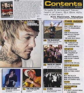
contents 4
 This is a contents page from NME. I think that this contents page will attract both sexes as the colour scheme is white, red and black. These are colours that both sexes will like. This is good as the magazine is widening their customer base.
The masthead is very clear but this is only the name of the magazine, it doesn’t tell you the name of the page which would be ‘Contents’. This would be better if it did have a masthead saying ‘contents’ because the customer would be able to see what page they are one. I do think that the NME is a bit overpowered by the heading ‘THIS WEEK’, this is because this title is very big and bold and it has a striking font because it catches the readers eye straight away.
The colours are very cleverly used because it doesn’t attract one sex it catches the attention of both of the sexes. This is good because they will get more customers buying the magazine because they are advertising at a variety of people. I think I will be using neutral colours or colours that will appeal to both sexes. This is because more people will like the look of the magazine.
The contents listing is very squashed and there isn’t a specific contents listing I think that this page is just telling the reader what is happening about music and also what is coming up in the magazine. I think that their should be a contents listing that is clear because if a customer just wants to read a particular story then they will be able to find the page on the contents listing and go to it straight away, if this doesn’t happen then they will have to look through all the pages in the magazine and the customer might get annoyed. In addition I think that the customer will get very confused and lost on this page because it is so cramped. When I am doing my contents page I am going to make it clear and easy to understand for the reader so they don’t get confused.
There are 2 images on the page and these images are for the main story, they are big and eye catching this is because it will draw the reader’s eye into the picture so then they will read the main story and will want to read more. The image is a model shot and it s whole body shot. This shot shows the whole of the body and this will show the reader who the picture are of and what they are doing in the picture. in these pictures they are in a show, this relates to the headline of ‘oasis kicked of their world tour’.
vibe contets analysis

This is my third contents page and I think it is very eye catching at will catch the customer’s eye. This is only because of the picture. I also think that this contents page will attract mainly boys/men because they will like who is on the picture. This is because she appeals to them and they will think she is physically attractive.
I don't think the language on the contents is very good because it is really small and this will put the customers off reading what the magazine features this is because they wouldn’t be bothered to read all the small text. I think this magazine could be improved if the writing was bigger and also it had numbers next to what the magazine is featuring. I think this would have made the contents page a lot more appealing to the eye.
Monday, 28 September 2009
contents page analysis
 This is my second contents page and it is from ‘Kerrang’ the music magazine. I think this contents page would mainly attract boys to look at it I think this is because it is mainly about boy bands and the colours are very boyish and dull. This won't attract girls because they like bright colours and pictures that stand out.
My first point I am going to analyse is the pictures that are on the contents page. There are many pictures, but only one big picture. This must mean that this picture is of the main story in the magazine. This is good that the main story has the biggest picture so the customers would be able to tell that he is the main story. These pictures are squashed together but I think by doing this it is very effective for the readers eye. This is because lots of pictures will do this and also the customer thinks that because there is lots of pictures there won’t be much writing.
The masthead, isn’t very clear because it is squashed and isn’t as big as most people make their title. By doing this it won’t catch the reader’s eye because it won’t stand out. Also it won’t stand out because the entire masthead isn’t in uppercase; this is different to most music magazines. However, it might stand out because the colours of the masthead are contrasting because the yellow contrasts the black background.
The layout of the magazine is good because it has a square of pictures that draw the customer’s eye in and also it has a link back to the contents page with writing about it by the side. Also the text makes a frame around the pictures which makes the pictures jump out. On the other hand, I think that the layout isn’t that good because the writing is all squashed onto the page and this would make it harder for the customer to read. I also think that there is to much on the page which makes it very hard for the customers to read the text, also they are drawn in by the pictures they wouldn’t bother to read the text.
Finally, the colours that are used are very boyish and wont appeal to girls, this might be a bad because it will be losing out on customers buying the magazine. The main colours that are used are yellow, black and grey. Grey is the main background which makes the whole page look dull. The black is used for the text to make it stand out from the grey and the yellow is used to make important headings/subheadings stand out. This will attract the eye because the yellow contrasts with the black background.
NME contents anaylsis

This is the first contents I am going to analyse. This is a contents page from NME music magazine. The first point I am going to write about is the colours that NME have used.
The colours that the designer has used for this content page are very bright and are in your face. The designer has done this so it catches the eye of the reader. The main 3 colours are white, pink and black. I think these colours will attract more to girls because it has the colour pink on it. I think the colours are very attractive to the eye; this is good because when the customer is looking through the magazine this page will catch their eye and they will stop and read the contents. This is good because most customers won’t look at the contents so the designer of the magazine needs to make it stand out.
The masthead isn’t very clear at all and the customer wouldn’t be able to tell that this page is the contents page. This isn’t good because if the customer doesn’t know what the page is I don’t think they will stop and read the page. I think the designer has to make it clear to the customer that this page is the contents.
The layout of the magazine is very messy and squashed up this is hard to read and will be confusing to the customer. The writing is also very small so this would also make the contents page very hard to read. Also I think that because there is so much writing on the contents page the customer wont read it because it is too small and there is too much so it wont appeal to the customer.
The contents listings are very simple and the numbers are bold so the customer will be able to tell where the contents listings are on the page. Also I think the designer has tried and made a border around the contents listings to make it stand out a lot more.
There aren’t many pictures on the contents page, I think this is because the designer wanted there to be a lot more information then pictures. There are two main pictures on the contents page and these are the pictures of the band that is the main focus of the magazine. The pictures brake up the writing a little bit so the writing isn’t all squashed.
Finally I think that the designer has used promotional offers on the contents page so the customer will look at it and will be interested. This is a good technique because customers love promotional offers. This means their eye will be attracted to these offers meaning they will look at the contents page.
Magazine Analysis House Style
Check out this SlideShare Presentation:
Magazine Analysis House Style
View more presentations from beckymahan2003.
Thursday, 24 September 2009
Spin music magazine analysis
 This magazine is called ‘SPIN’. I think that this magazine is targeted mainly a girls but boys can buy it as well. This is because the artist on the front is a woman; also the magazine looks very feminine so I don’t think that many boys would want to buy it.
 One of the technique that is used on the magazine is that they have put the splash as a sub heading instead of a splash; this means that this won’t disturb the image. The designers make the splash stand out by making the font a lot bigger than the rest of the sub headings this is so the splash catches the customer’s attention. You can also argue that the subheading ‘Q tip’ could also be the splash because it is the same size or even bigger than the actual splash about Duffy.
The masthead is very big and bold and stands out on the magazine this is because it is has a red back ground and white writing, the background on the magazine is white so they have contrast between the red and white so this is what makes it stands out. The masthead also stands out because it is in uppercase and is in a very big size. The location of the masthead is in the left top hand corner which means that when the magazine is all in a stand the customer will be able to see the masthead as it will stand out.
The layout of the magazine is similar to all of the other music magazines; it makes a frame around the image to draw the reader’s eye in so the customer will focus on the image and it makes the image seem bigger. Also none of the writing goes on the body or head of the image; this shows the customer that the image is the most important thing on the magazine and will also draw the customer’s eyes in.
The colours of the magazine are very simple and the magazine only has the colour red on the background of the title so this will make stand out more and this makes a contrast between the colours. The colours that are used are black, blue and yellow; these colours are the only colours that are used on the front cover for the sub headings. This makes it look professional because they are keeping the colours consistent.
Finally the image on the front cover might attract the boys to the magazine because they might be attracted to her figure, her beauty or just her singing. The girls will be attracted to the gossip which is inside the magazine about the singer and also they will like her singing so they will buy the magazine. Also the image is on top of the masthead this is a technique called layering. This is effective as it will show the reader that Duffy is the most important thing on the magazine. The shot that is on the front cover is a model shot and it is a full body shot, the reader will be able to interpret that the shot of Duffy is not a paparazzi shot.
Tuesday, 22 September 2009
Q the music magazine analysis

This magazine is called 'Q' and its target audience would be most people both women and men that like indie music. The magazine offers information about bands and groups that are big in the market; this will attract people to the magazine as they would want to get to know a lot more about the band or group.
The colours of the magazine are very basic but are bright and stand out on the magazine, this might be because the magazine has a white background and any bright colours stand out. The colours that are used are red, black, white and yellow. There aren’t many colours which makes the magazine look better as it makes it look professional. The big splash (the bands name) on the image is yellow and this makes the splash stand out as the band are all wearing black, this is good so it makes it very easy for the customer to spot and also it is catching for the customers eye. It is good that the splash is in this bright colour and stands out because it is the main headline and people need to see it so they want to read more about their favourite band. The red ties in with the masthead/logo of the magazine.
The colours of the magazine are very basic but are bright and stand out on the magazine, this might be because the magazine has a white background and any bright colours stand out. The colours that are used are red, black, white and yellow. There aren’t many colours which makes the magazine look better as it makes it look professional. The big splash (the bands name) on the image is yellow and this makes the splash stand out as the band are all wearing black, this is good so it makes it very easy for the customer to spot and also it is catching for the customers eye. It is good that the splash is in this bright colour and stands out because it is the main headline and people need to see it so they want to read more about their favourite band. The red ties in with the masthead/logo of the magazine.
The image on the front cover is very big and takes up most of the page; this has the effect of making it easier for the customer to see what the main story is of the magazine. Also the image is of ‘Coldplay’ who are a very well known band and are very good song writers and singers. The image is a full body shot, so if the reader is a girl or a boy they can see the whole body image they are wearing. The facial expressions on ‘Coldplay’ are very serious and look like that they are in fear, this is linked together with the splash that is on the their bodies. This is a good thing to do as it will give the reader an idea of what the story is about. The head of the band member on the back row (Jonathan Buckland) is above the masthead, this is a technique called layering and it is very effective as it shows the reader that the band Is the most important thing on the cover. The shot that is taken is a model shot as it is posed for and they have taken their time to get the picture right to get the best picture to work on the front cover.
The layout of the magazine is similar to every other music magazine that is on the market, this is because most of the magazines want the main story to be in capital letters so that it is easy for the customer to read it and they won’t need to get up close. The second thing that is similar on most of the magazines is how the magazine creates a border or frame for the magazine so it draws the customer’s eyes into the picture in the middle. The one thing that is different on this magazine to any other is that the splash is across the image on the front cover, most magazines like to keep this clear so the reader can see all of the body on the model. But this is what is so effective because the reader will then know if they have never heard of Coldplay or seen the band members they would know that this splash is about the band on the front.
Finally, the language is informal; you can tell this by the language that is used and also the font that is used as well. The language that has been used is stuff like ‘bloc’, ‘hell’ and ‘craziest’. The words show the customer that the magazine is informal and that it is more targeted and young people because they would understand words like ‘bloc’ a lot easier. You can tell from the font because it is a basic bold font and it stands out, if they had a formal font it would be fancy and not bold, so the magazine has gone for a font that would catch the eye of the customer so they will have more sales.
Monday, 21 September 2009
'Vibe' cover research analysis

This is 'Vibe' the music magazine, as you can see this magazine is aimed at both women and men that are into music. This magazine offers information and gossip about a variety of music such as; R&B, John Legend, Ne-yo and Lloyd. This is so the magazine is aimed at a lot of people so it has a bigger customer base buying the magazine, which means more income for the magazine.
The picture on the front of the magazine is a model called Ciara. Ciara is a well known music writer and this picture on the magazine will appeal to both sex's because it will appeal to the boys because she is what a boy 'needs' and likes from a women. this includes things like a slender figure, someone who they think is sexy and also this is appealing to them as she has no clothes on and is crouched down to cover herself up so the boys might want to buy this magazine because they will want to read on and see other pictures of Ciara. But she will still appeal to women because she is a great artist and people will want to know what she is doing and read more about her. This image isn't like a typical image on a music magazine cover, the models are usually stood up and it is a full length body shot rather then a crouched shot of the body. The reader could interpret the model being shy and a quiet singer if they don't know who she is. also they might think that she is scared to 'stand up' as that is the caption beside Ciara and she crouched down. the shot of ciara is in front of the masthead this means that the image is a lot more important than the title. This is a technique called layering it is very effective as it makes the image look bigger to the reader because they haven't got something over their head, it also shows the reader who is more important.
The colours of the magazine are very dull and not very colourful. I think that the designer has done this so the text that is in red stands out a lot more and that is the text that is most important and because it is so bright this is what the reader will read first. The colour scheme follows a pattern of just a few colours which are red, black and white.
I think the layout of the magazine makes a frame for the model which makes her seem bigger to the reader as they focus their eye on her. the only word that doesn't stick to the frame and structure of the page is the word 'Ciara' i think this is because the designer wanted this word to go across her body so the readers that don't know who she is will know that the model is Ciara. The designer has also made this word in upper case letters that are red this is so it catches the attention of a customer walking past the magazine.
As you can tell the language on the magazine is informal this is because the words that are used and also the text that is used. The language that is used is words like 'sex', 'gonna' and 'pretty ricky', these words tell the reader that it is an informal magazine because some of the words aren't pronounced properly, this could mean that the magazine has a lot of gossip,so automatically this attracts customers that like gossip and are nosey.
Finally, the masthead is nearly the same colour of the background so i think that customers might be able to read what the name of the magazine is called, this might also be because of Ciara head in the middle of the masthead. This shows that the masthead isn't that important as the designer wants people to see ciara more than the masthead because if people see an artist they like they will buy the magazine regardless of the name of it.
Kerrang magazine cover, music magazine research
 This magazine is called 'Kerrang' and this is the second magazine i am going to analyse. The first technique i am going to comment about it the masthead. This masthead is big and bold to stand out and catch the public eye. The word 'Kerrang' is in black upper case letters and has an exclamation mark at the end and this shows us that it is as if the title is being shouted out at as, also this might mean that this makes the reader think the magazine is an informal magazine. you can also tell it is an informal magazine from the font that is used. The word 'Kerrang' is cracked and this tells the reader that the music is too loud and it has shattered the letters. This is a good technique as it is different and it catches the audiences eye.
Secondly, the layout of this magazine is generally messy because all the sub-headings are thrown all over the page and the model that they have got on the front. The only part of the front cover that is in a frame is the pictures that are on the left side of the magazine, this creates a frame for the picture of the model in the middle.
The model on the magazine cover is holding a microphone, this could interpret that the model is singing and he could be singing too loud and that is also why the 'Kerrang' title is cracked and smashed like a glass window would shatter if someone was singing badly. The public could interpret that the band is rubbish at singing and then this might mean that people wont buy the magazine or the album or single that they have out. Also the model's face is in front of the title on the magazine, this is a technique called layering, this shows that the designer thinks that the model is a lot more important than the magazine, on most of the magazines the most important thing is going to be central and big on the front to people know who is in the magazine and know what genre of music it is. . This is because they think that the model will sell the magazine. This shot of the model is a model shot and it is mainly a head shot, this means that the model was ready for the photographer to take the picture and he was posing for it. Also he will get to pick the picture that he wants to be on the front cover where as a paparazzi shot is taken with out the model permission and whatever picture they get they will publish.
Finally, the colours are very dull and dark, which makes the reader think that the music is quite dull as well. The only colour that is on the page is the red for the title 'Converge', this makes the name of the band stand out to the reader which catches there attention. I think with the colours being this colour it will show the audience the genre of music that the music will be talking about inside.
Sunday, 20 September 2009
Front cover music magazine research
 This magazine 'NME' has a lot of techniques to comment about. The first thing i am going to comment about is going to be the colours that the magazine uses. The magazine only uses three main colours which are; red, orange and yellow. This is like the sun or like fire, therefore this could mean that they are trying to get the point across that the magazine is on fire and is red hot to buy. These colours are also very eye catching for the public as they stand out. The colours suggest that it is a uni-sex magazine and both women and men can buy it.
 The second feature i am going to talk about on the magazine is the Masthead. the masthead is very bold and stands out. It has a shadow behind the writing making the masthead stand out even more. The font of the mast head is informal and this makes the reader think that the magazine is informal as well. The masthead is the biggest thing on the front cover because the designers want it to stand out so it catches the eyes of the public.
Furthermore, the layout of the magazine creates a frame all around the body of the picture, meaning it will draw the eyes of the public to the picture. the designers haven't put any writing or anything else on the main part of the body so the readers can see all of the body as it is the main part of the front cover along with the masthead.
The picture on the front cover is very eye catching and makes the readers look as the magazine as it isn't what people usually like to see, this is because she isn't the typical thin, beautiful women with a perfect figure. The designers have done this because more people want to know what is inside the magazine and will want to read more. This is very clever as this magazine is the best selling magazine from 'NME'. The reader can also tell that this is a model picture and has been shot professionally rather then being a paparazzi shot, from this picture you can tell that she doesn't care what people think about her and her body because she is proud of what she has got. the facial expressions shows the reader that she is very sexy and likes posing a lot.
Finally, the language of this magazine shows me that it is very informal as it has words on the cover such as 'kiss my ass' in upper case letters. This means that it will usually appeal to people that have a sense of humor and like to find out a lot more. I think a magazine being informal will attract a lot more customer then a music magazine being formal.
Friday, 18 September 2009
Welcome To My Blog!
Hello, my name is Rebecca Mahan, this is my blog for my media studies coursework. On this blog I am going to post all my reseach and my prelim for my school magazine, then finally i will create my own music magazine.
Subscribe to:
Comments (Atom)