Monday, 28 September 2009

contents page analysis

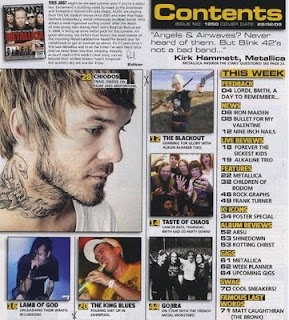
This is my second contents page and it is from ‘Kerrang’ the music magazine. I think this contents page would mainly attract boys to look at it I think this is because it is mainly about boy bands and the colours are very boyish and dull. This won't attract girls because they like bright colours and pictures that stand out.

My first point I am going to analyse is the pictures that are on the contents page. There are many pictures, but only one big picture. This must mean that this picture is of the main story in the magazine. This is good that the main story has the biggest picture so the customers would be able to tell that he is the main story. These pictures are squashed together but I think by doing this it is very effective for the readers eye. This is because lots of pictures will do this and also the customer thinks that because there is lots of pictures there won’t be much writing.

The masthead, isn’t very clear because it is squashed and isn’t as big as most people make their title. By doing this it won’t catch the reader’s eye because it won’t stand out. Also it won’t stand out because the entire masthead isn’t in uppercase; this is different to most music magazines. However, it might stand out because the colours of the masthead are contrasting because the yellow contrasts the black background.

The layout of the magazine is good because it has a square of pictures that draw the customer’s eye in and also it has a link back to the contents page with writing about it by the side. Also the text makes a frame around the pictures which makes the pictures jump out. On the other hand, I think that the layout isn’t that good because the writing is all squashed onto the page and this would make it harder for the customer to read. I also think that there is to much on the page which makes it very hard for the customers to read the text, also they are drawn in by the pictures they wouldn’t bother to read the text.

Finally, the colours that are used are very boyish and wont appeal to girls, this might be a bad because it will be losing out on customers buying the magazine. The main colours that are used are yellow, black and grey. Grey is the main background which makes the whole page look dull. The black is used for the text to make it stand out from the grey and the yellow is used to make important headings/subheadings stand out. This will attract the eye because the yellow contrasts with the black background.

NME contents anaylsis

This is the first contents I am going to analyse. This is a contents page from NME music magazine. The first point I am going to write about is the colours that NME have used.

The colours that the designer has used for this content page are very bright and are in your face. The designer has done this so it catches the eye of the reader. The main 3 colours are white, pink and black. I think these colours will attract more to girls because it has the colour pink on it. I think the colours are very attractive to the eye; this is good because when the customer is looking through the magazine this page will catch their eye and they will stop and read the contents. This is good because most customers won’t look at the contents so the designer of the magazine needs to make it stand out.

The masthead isn’t very clear at all and the customer wouldn’t be able to tell that this page is the contents page. This isn’t good because if the customer doesn’t know what the page is I don’t think they will stop and read the page. I think the designer has to make it clear to the customer that this page is the contents.

The layout of the magazine is very messy and squashed up this is hard to read and will be confusing to the customer. The writing is also very small so this would also make the contents page very hard to read. Also I think that because there is so much writing on the contents page the customer wont read it because it is too small and there is too much so it wont appeal to the customer.

The contents listings are very simple and the numbers are bold so the customer will be able to tell where the contents listings are on the page. Also I think the designer has tried and made a border around the contents listings to make it stand out a lot more.

There aren’t many pictures on the contents page, I think this is because the designer wanted there to be a lot more information then pictures. There are two main pictures on the contents page and these are the pictures of the band that is the main focus of the magazine. The pictures brake up the
writing a little bit so the writing isn’t all squashed.

Finally I think that the designer has used promotional offers on the contents page so the customer will look at it and will be interested. This is a good technique because customers love promotional offers. This means their eye will be attracted to these offers meaning they will look at the contents page.

Magazine Analysis House Style

Check out this SlideShare Presentation:

Thursday, 24 September 2009

Spin music magazine analysis

This magazine is called ‘SPIN’. I think that this magazine is targeted mainly a girls but boys can buy it as well. This is because the artist on the front is a woman; also the magazine looks very feminine so I don’t think that many boys would want to buy it.

One of the technique that is used on the magazine is that they have put the splash as a sub heading instead of a splash; this means that this won’t disturb the image. The designers make the splash stand out by making the font a lot bigger than the rest of the sub headings this is so the splash catches the customer’s attention. You can also argue that the subheading ‘Q tip’ could also be the splash because it is the same size or even bigger than the actual splash about Duffy.

The masthead is very big and bold and stands out on the magazine this is because it is has a red back ground and white writing, the background on the magazine is white so they have contrast between the red and white so this is what makes it stands out. The masthead also stands out because it is in uppercase and is in a very big size. The location of the masthead is in the left top hand corner which means that when the magazine is all in a stand the customer will be able to see the masthead as it will stand out.

The layout of the magazine is similar to all of the other music magazines; it makes a frame around the image to draw the reader’s eye in so the customer will focus on the image and it makes the image seem bigger. Also none of the writing goes on the body or head of the image; this shows the customer that the image is the most important thing on the magazine and will also draw the customer’s eyes in.


The colours of the magazine are very simple and the magazine only has the colour red on the background of the title so this will make stand out more and this makes a contrast between the colours. The colours that are used are black, blue and yellow; these colours are the only colours that are used on the front cover for the sub headings. This makes it look professional because they are keeping the colours consistent.

Finally the image on the front cover might attract the boys to the magazine because they might be attracted to her figure, her beauty or just her singing. The girls will be attracted to the gossip which is inside the magazine about the singer and also they will like her singing so they will buy the magazine. Also the image is on top of the masthead this is a technique called layering. This is effective as it will show the reader that Duffy is the most important thing on the magazine. The shot that is on the front cover is a model shot and it is a full body shot, the reader will be able to interpret that the shot of Duffy is not a paparazzi shot.

Tuesday, 22 September 2009

Q the music magazine analysis


This magazine is called 'Q' and its target audience would be most people both women and men that like indie music. The magazine offers information about bands and groups that are big in the market; this will attract people to the magazine as they would want to get to know a lot more about the band or group.
The colours of the magazine are very basic but are bright and stand out on the magazine, this might be because the magazine has a white background and any bright colours stand out. The colours that are used are red, black, white and yellow. There aren’t many colours which makes the magazine look better as it makes it look professional. The big splash (the bands name) on the image is yellow and this makes the splash stand out as the band are all wearing black, this is good so it makes it very easy for the customer to spot and also it is catching for the customers eye. It is good that the splash is in this bright colour and stands out because it is the main headline and people need to see it so they want to read more about their favourite band. The red ties in with the masthead/logo of the magazine.
The image on the front cover is very big and takes up most of the page; this has the effect of making it easier for the customer to see what the main story is of the magazine. Also the image is of ‘Coldplay’ who are a very well known band and are very good song writers and singers. The image is a full body shot, so if the reader is a girl or a boy they can see the whole body image they are wearing. The facial expressions on ‘Coldplay’ are very serious and look like that they are in fear, this is linked together with the splash that is on the their bodies. This is a good thing to do as it will give the reader an idea of what the story is about. The head of the band member on the back row (Jonathan Buckland) is above the masthead, this is a technique called layering and it is very effective as it shows the reader that the band Is the most important thing on the cover. The shot that is taken is a model shot as it is posed for and they have taken their time to get the picture right to get the best picture to work on the front cover.
The layout of the magazine is similar to every other music magazine that is on the market, this is because most of the magazines want the main story to be in capital letters so that it is easy for the customer to read it and they won’t need to get up close. The second thing that is similar on most of the magazines is how the magazine creates a border or frame for the magazine so it draws the customer’s eyes into the picture in the middle. The one thing that is different on this magazine to any other is that the splash is across the image on the front cover, most magazines like to keep this clear so the reader can see all of the body on the model. But this is what is so effective because the reader will then know if they have never heard of Coldplay or seen the band members they would know that this splash is about the band on the front.
Finally, the language is informal; you can tell this by the language that is used and also the font that is used as well. The language that has been used is stuff like ‘bloc’, ‘hell’ and ‘craziest’. The words show the customer that the magazine is informal and that it is more targeted and young people because they would understand words like ‘bloc’ a lot easier. You can tell from the font because it is a basic bold font and it stands out, if they had a formal font it would be fancy and not bold, so the magazine has gone for a font that would catch the eye of the customer so they will have more sales.

Monday, 21 September 2009

'Vibe' cover research analysis

This is 'Vibe' the music magazine, as you can see this magazine is aimed at both women and men that are into music. This magazine offers information and gossip about a variety of music such as; R&B, John Legend, Ne-yo and Lloyd. This is so the magazine is aimed at a lot of people so it has a bigger customer base buying the magazine, which means more income for the magazine. 

The picture on the front of the magazine is a model called Ciara. Ciara is a well known music writer and this picture on the magazine will appeal to both sex's because it will appeal to the boys because she is what a boy 'needs' and likes from a women. this includes things like a slender figure, someone who they think is sexy and also this is appealing to them as she has no clothes on and is crouched down to cover herself up so the boys might want to buy this magazine because they will want to read on and see other pictures of Ciara. But she will still appeal to women because she is a great artist and people will want to know what she is doing and read more about her. This image isn't like a typical image on a music magazine cover, the models are usually stood up and it is a full length body shot rather then a crouched shot of the body. The reader could interpret the model being shy and a quiet singer if they don't know who she is. also they might think that she is scared to 'stand up' as that is the caption beside Ciara and she crouched down. the shot of ciara is in front of the masthead this means that the image is a lot more important than the title. This is a technique called layering it is very effective as it makes the image look bigger to the reader because they haven't got something over their head, it also shows the reader who is more important.  

The colours of the magazine are very dull and not very colourful. I think that the designer has done this so the text that is in red stands out a lot more and that is the text that is most important and because it is so bright this is what the reader will read first. The colour scheme follows a pattern of just a few colours which are red, black and white. 

I think the layout of the magazine makes a frame for the model which makes her seem bigger to the reader as they focus their eye on her. the only word that doesn't stick to the frame and structure of the page is the word 'Ciara' i think this is because the designer wanted this word to go across her body so the readers that don't know who she is will know that the model is Ciara. The designer has also made this word in upper case letters that are red this is so it catches the attention of a customer walking past the magazine.

As you can tell the language on the magazine is informal this is because the words that are used and also the text that is used. The language that is used is words like 'sex', 'gonna' and 'pretty ricky', these words tell the reader that it is an informal magazine because some of the words aren't pronounced properly, this could mean that the magazine has a lot of gossip,so automatically this attracts customers that like gossip and are nosey.

Finally, the masthead is nearly the same colour of the background so i think that customers might be able to read what the name of the magazine is called, this might also be because of Ciara head in the middle of the masthead. This shows that the masthead isn't that important as the designer wants people to see ciara more than the masthead because if people see an artist they like they will buy the magazine regardless of the name of it. 

Kerrang magazine cover, music magazine research

This magazine is called 'Kerrang' and this is the second magazine i am going to analyse. The first technique i am going to comment about it the masthead. This masthead is big and bold to stand out and catch the public eye. The word 'Kerrang' is in black upper case letters and has an exclamation mark at the end and this shows us that it is as if the title is being shouted out at as, also this might mean that this makes the reader think the magazine is an informal magazine. you can also tell it is an informal magazine from the font that is used. The word 'Kerrang' is cracked and this tells the reader that the music is too loud and it has shattered the letters. This is a good technique as it is different and it catches the audiences eye.

Secondly, the layout of this magazine is generally messy because all the sub-headings are thrown all over the page and the model that they have got on the front. The only part of the front cover that is in a frame is the pictures that are on the left side of the magazine, this creates a frame for the picture of the model in the middle.

The model on the magazine cover is holding a microphone, this could interpret that the model is singing and he could be singing too loud and that is also why the 'Kerrang' title is cracked and smashed like a glass window would shatter if someone was singing badly. The public could interpret that the band is rubbish at singing and then this might mean that people wont buy the magazine or the album or single that they have out. Also the model's face is in front of the title on the magazine, this is a technique called layering, this shows that the designer thinks that the model is a lot more important than the magazine, on most of the magazines the most important thing is going to be central and big on the front to people know who is in the magazine and know what genre of music it is. . This is because they think that the model will sell the magazine. This shot of the model is a model shot and it is mainly a head shot, this means that the model was ready for the photographer to take the picture and he was posing for it. Also he will get to pick the picture that he wants to be on the front cover where as a paparazzi shot is taken with out the model permission and whatever picture they get they will publish.


Finally, the colours are very dull and dark, which makes the reader think that the music is quite dull as well. The only colour that is on the page is the red for the title 'Converge', this makes the name of the band stand out to the reader which catches there attention. I think with the colours being this colour it will show the audience the genre of music that the music will be talking about inside. 

Sunday, 20 September 2009

Front cover music magazine research

This magazine 'NME' has a lot of techniques to comment about. The first thing i am going to comment about is going to be the colours that the magazine uses. The magazine only uses three main colours which are; red, orange and yellow. This is like the sun or like fire, therefore this could mean that they are trying to get the point across that the magazine is on fire and is red hot to buy. These colours are also very eye catching for the public as they stand out. The colours suggest that it is a uni-sex magazine and both women and men can buy it.

The second feature i am going to talk about on the magazine is the Masthead. the masthead is very bold and stands out. It has a shadow behind the writing making the masthead stand out even more. The font of the mast head is informal and this makes the reader think that the magazine is informal as well. The masthead is the biggest thing on the front cover because the designers want it to stand out so it catches the eyes of the public.

Furthermore, the layout of the magazine creates a frame all around the body of the picture, meaning it will draw the eyes of the public to the picture. the designers haven't put any writing or anything else on the main part of the body so the readers can see all of the body as it is the main part of the front cover along with the masthead.

The picture on the front cover is very eye catching and makes the readers look as the magazine as it isn't what people usually like to see, this is because she isn't the typical thin, beautiful women with a perfect figure. The designers have done this because more people want to know what is inside the magazine and will want to read more. This is very clever as this magazine is the best selling magazine from 'NME'. The reader can also tell that this is a model picture and has been shot professionally rather then being a paparazzi shot, from this picture you can tell that she doesn't care what people think about her and her body because she is proud of what she has got. the facial expressions shows the reader that she is very sexy and likes posing a lot.

Finally, the language of this magazine shows me that it is very informal as it has words on the cover such as 'kiss my ass' in upper case letters. This means that it will usually appeal to people that have a sense of humor and like to find out a lot more. I think a magazine being informal will attract a lot more customer then a music magazine being formal.

Friday, 18 September 2009

Welcome To My Blog!

Hello, my name is Rebecca Mahan, this is my blog for my media studies coursework. On this blog I am going to post all my reseach and my prelim for my school magazine, then finally i will create my own music magazine.